Hänsel
Branding + Art Direction
2014
THE CLIENT–
Hänsel is a specialized sweets catering service based in Monterrey, Mexico. The brand started in 2014 as an initiative to compete in the event catering market in the city, at a time when most services offered only savory dishes.
THE OBJECTIVE–
As a local industry disruptor at the time, Hänsel had a lot of competitive advantage just for its services. The brand needed to reflect that disruption, and break the aesthetic of savory catering companies, which kept their color palettes either muted and neutral, or dark with pops of red and yellow. The brand voice also needed to feel unique and allusive of the sweet nature of the products.

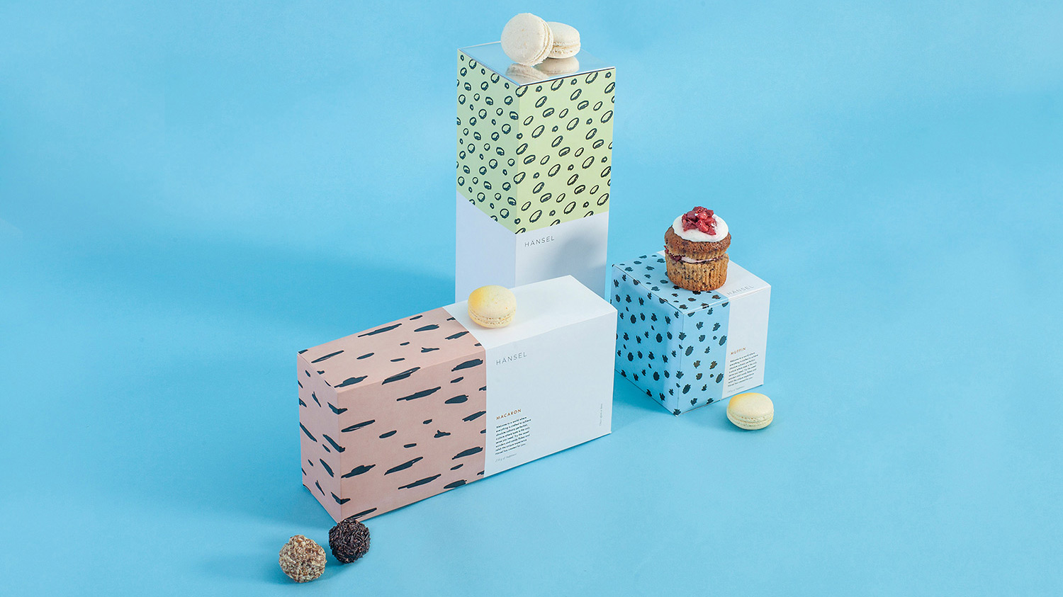
THE SOLUTION–
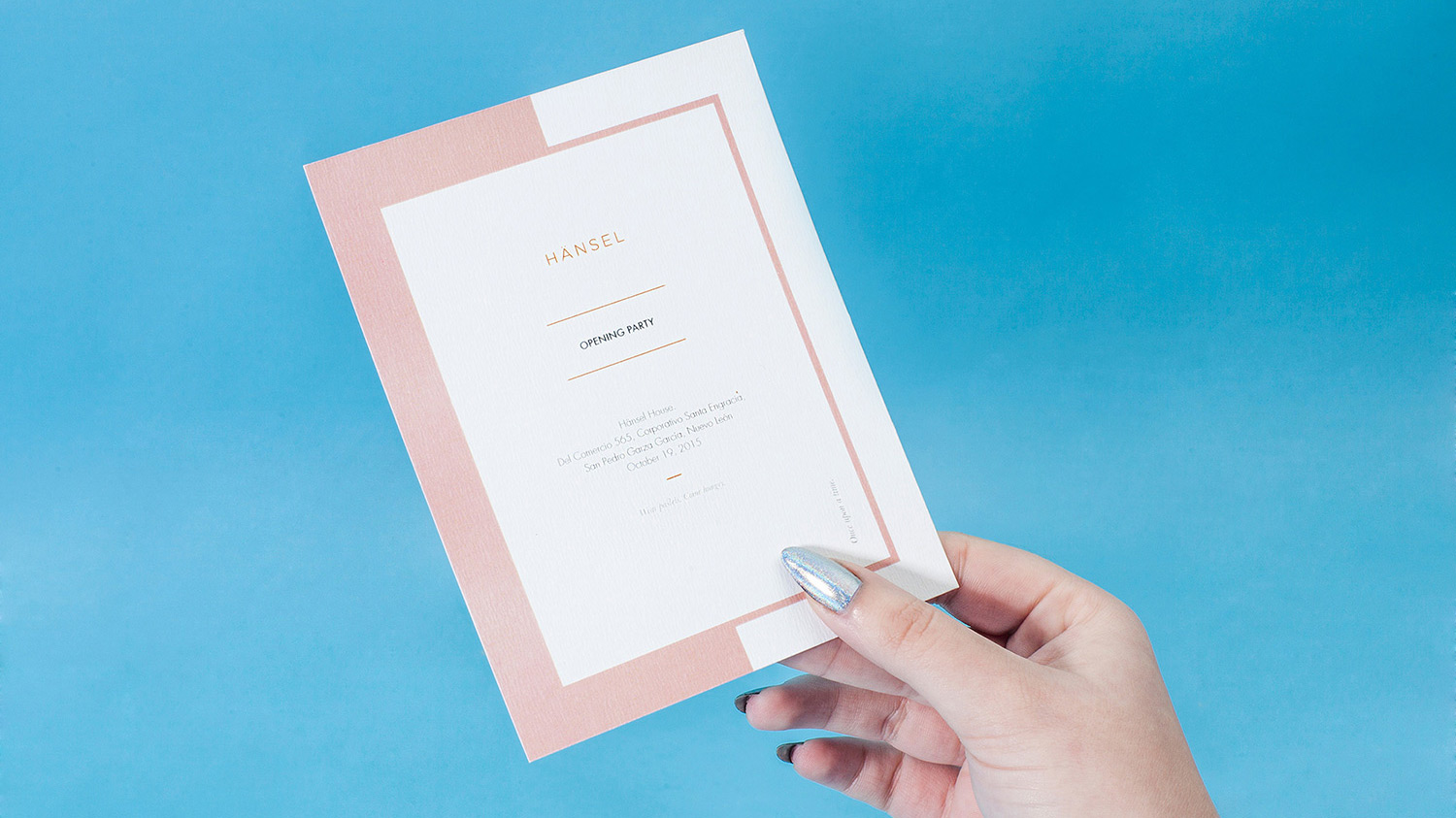
As part of the graphic design team at Chapter, I collaborated with the rest of the designers to come up with a brand presence that felt new and inviting. We selected a color palette made up of pastels and paired it with bold and contrasting handmade patterns. The deliverables also included the packaging for different kinds of sweets, which we custom-made to fit each type. Materiality was also a big part of the brand’s voice, so we joined forces with local stationery vendors who provided beautiful holographic cardstock used in several collateral pieces, including business cards, invitations, and boxes.
Photography by Juma Herrera for Nation Visuals.


This project was featured in the Branding homepage for Behance.net and in BranD Magazine (Hong Kong) in 2015.
© 2022 Beatriz Montaño